Hug
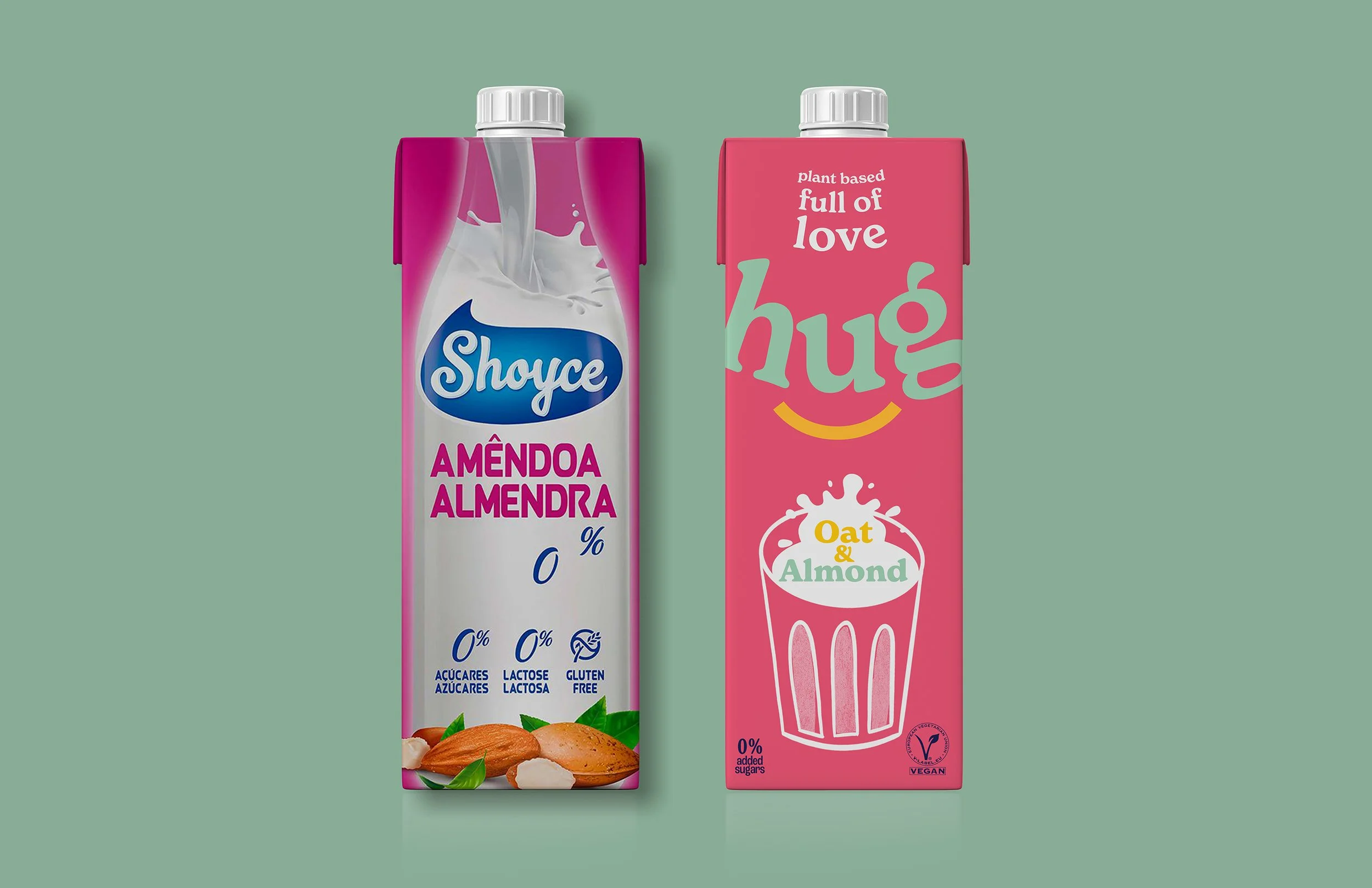
Shoyce, a plant-based Portuguese drink brand, wanted to rebrand. Its outdated design wasn’t able to compete with distinctive new competitors on shelf anymore. They wanted to connect with their audience emotionally and to have a bold, visual impact.
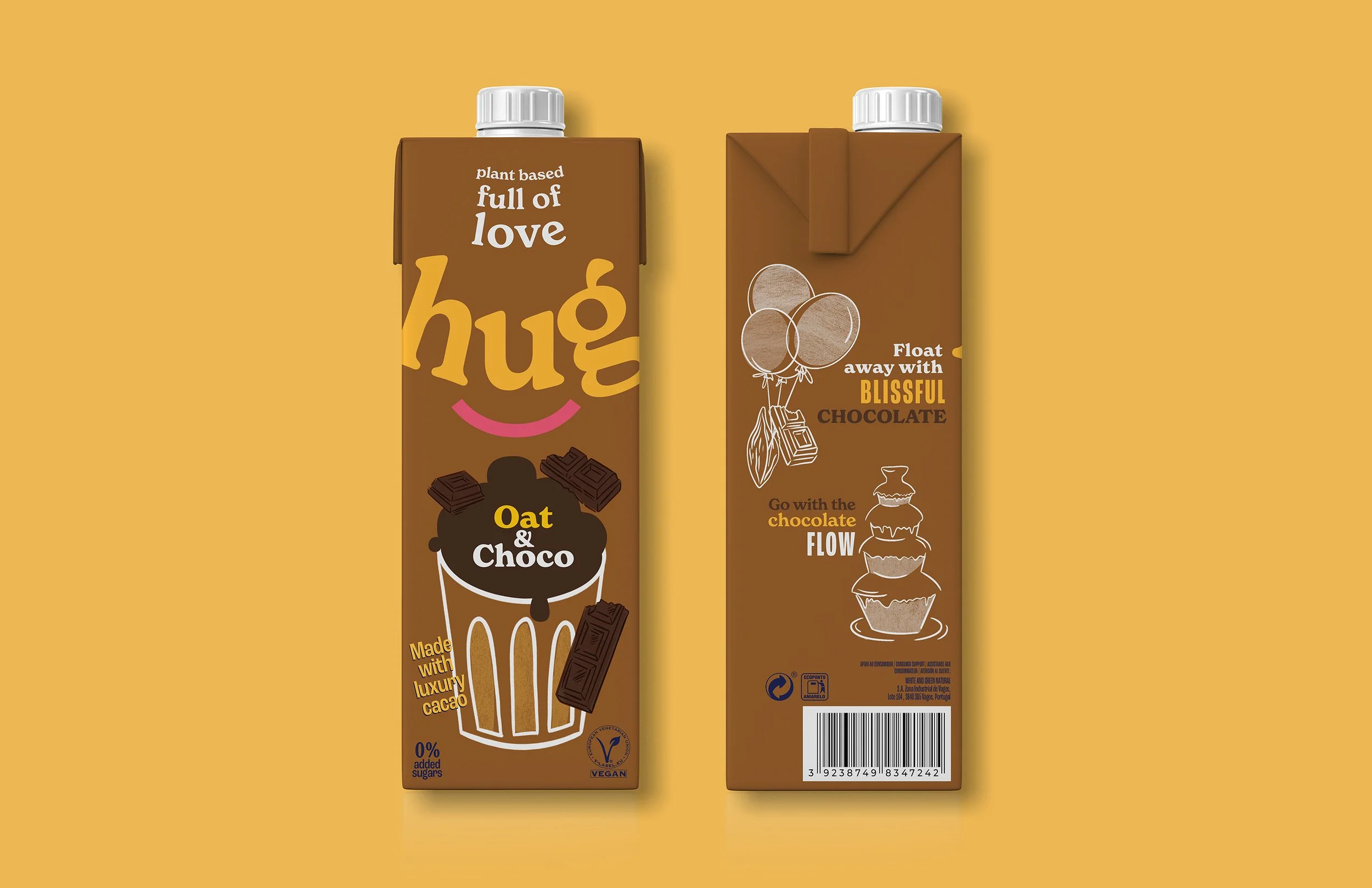
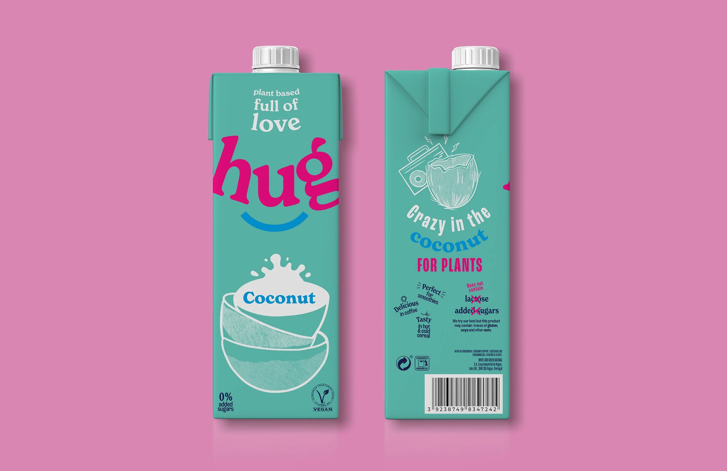
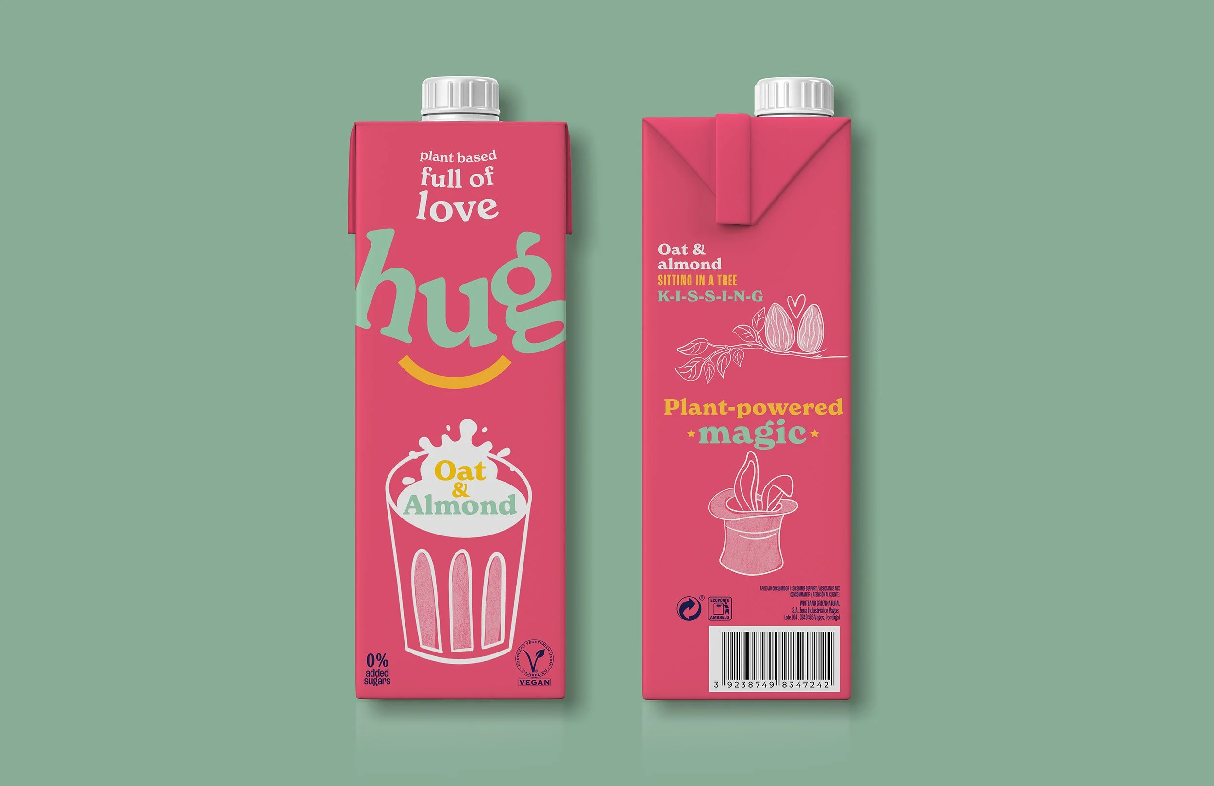
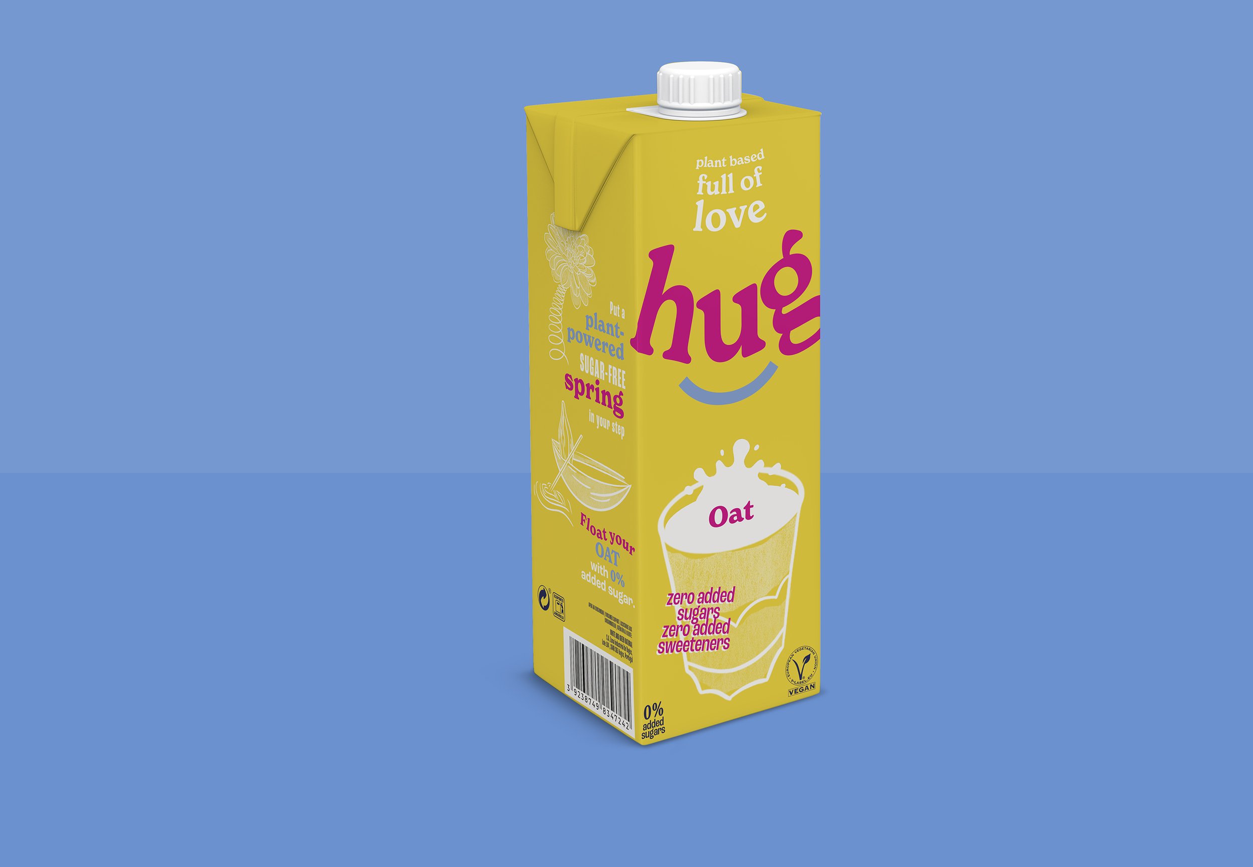
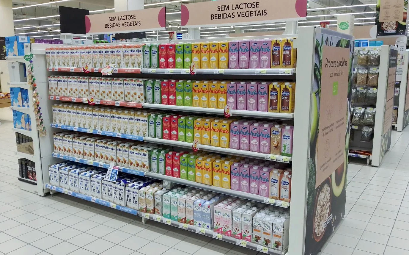
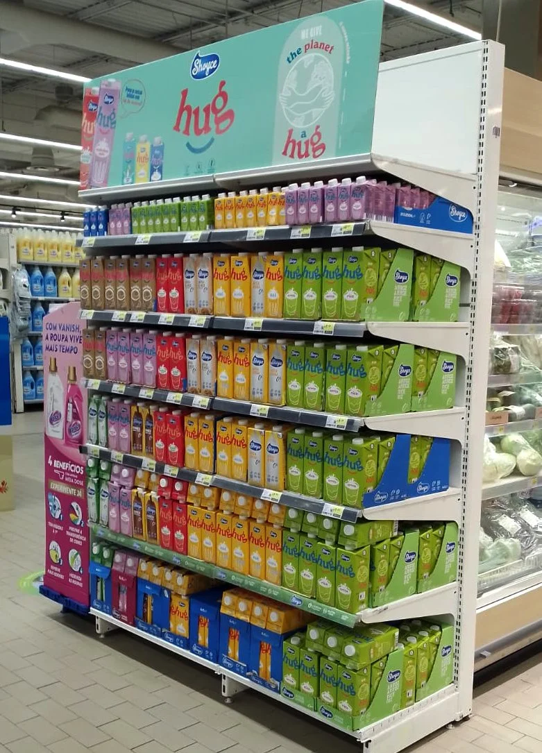
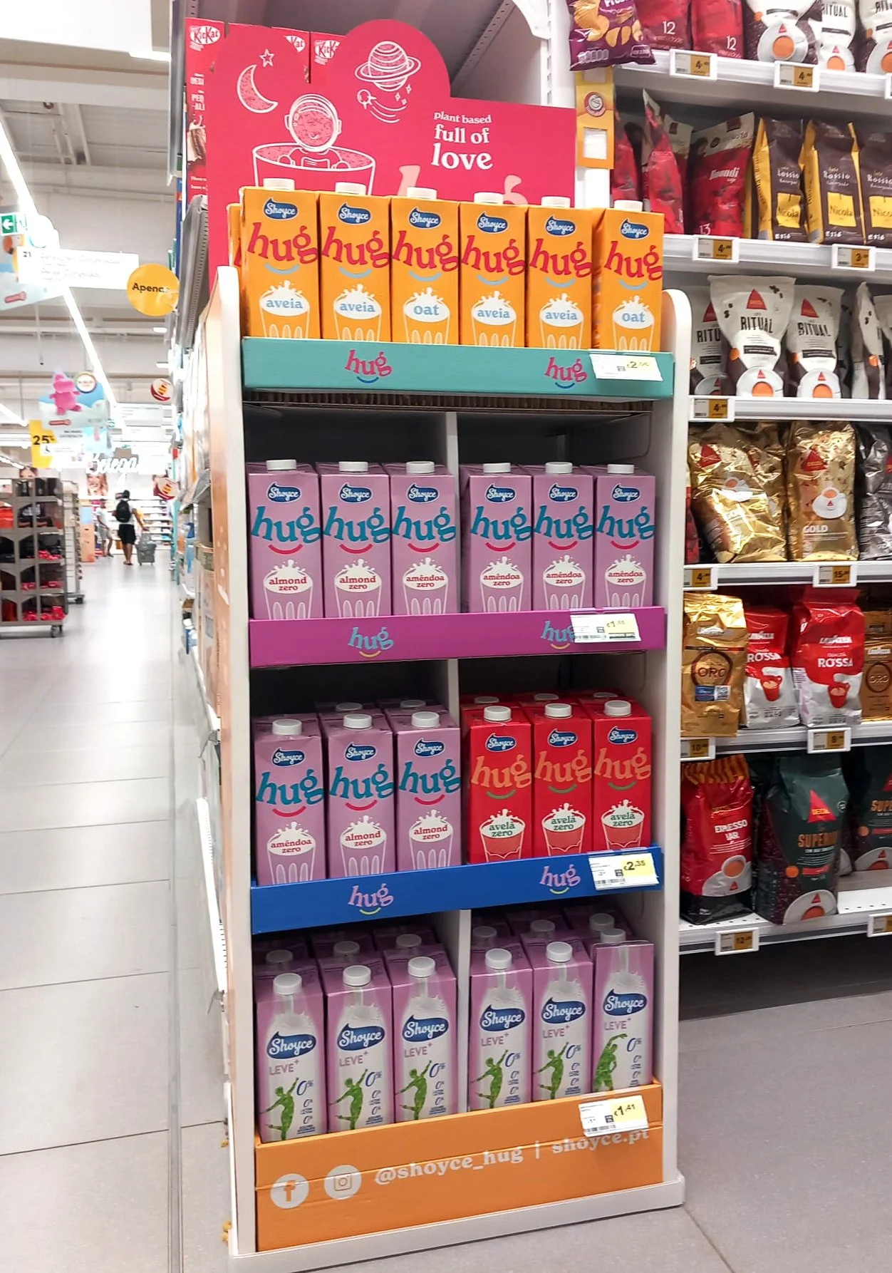
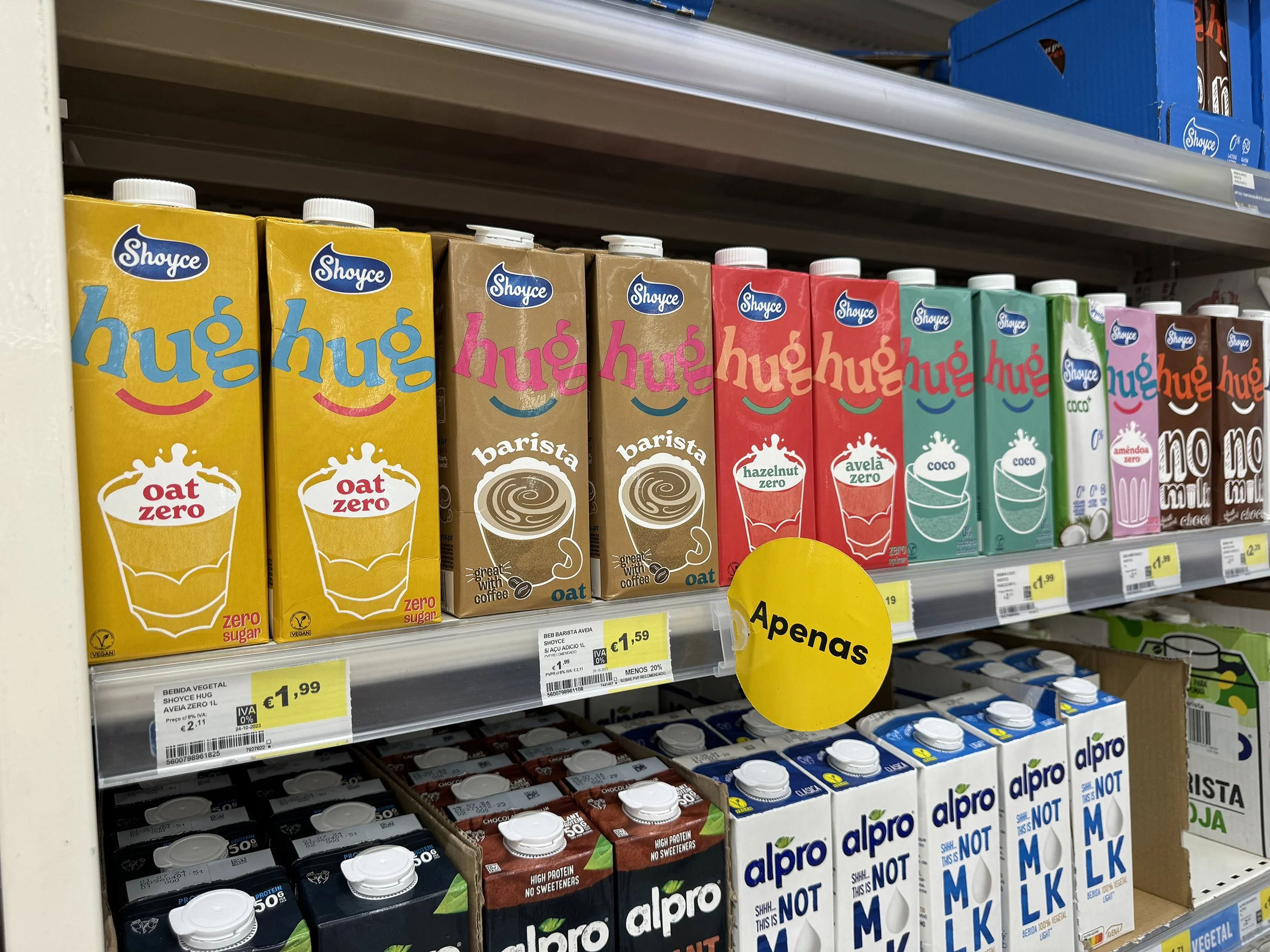
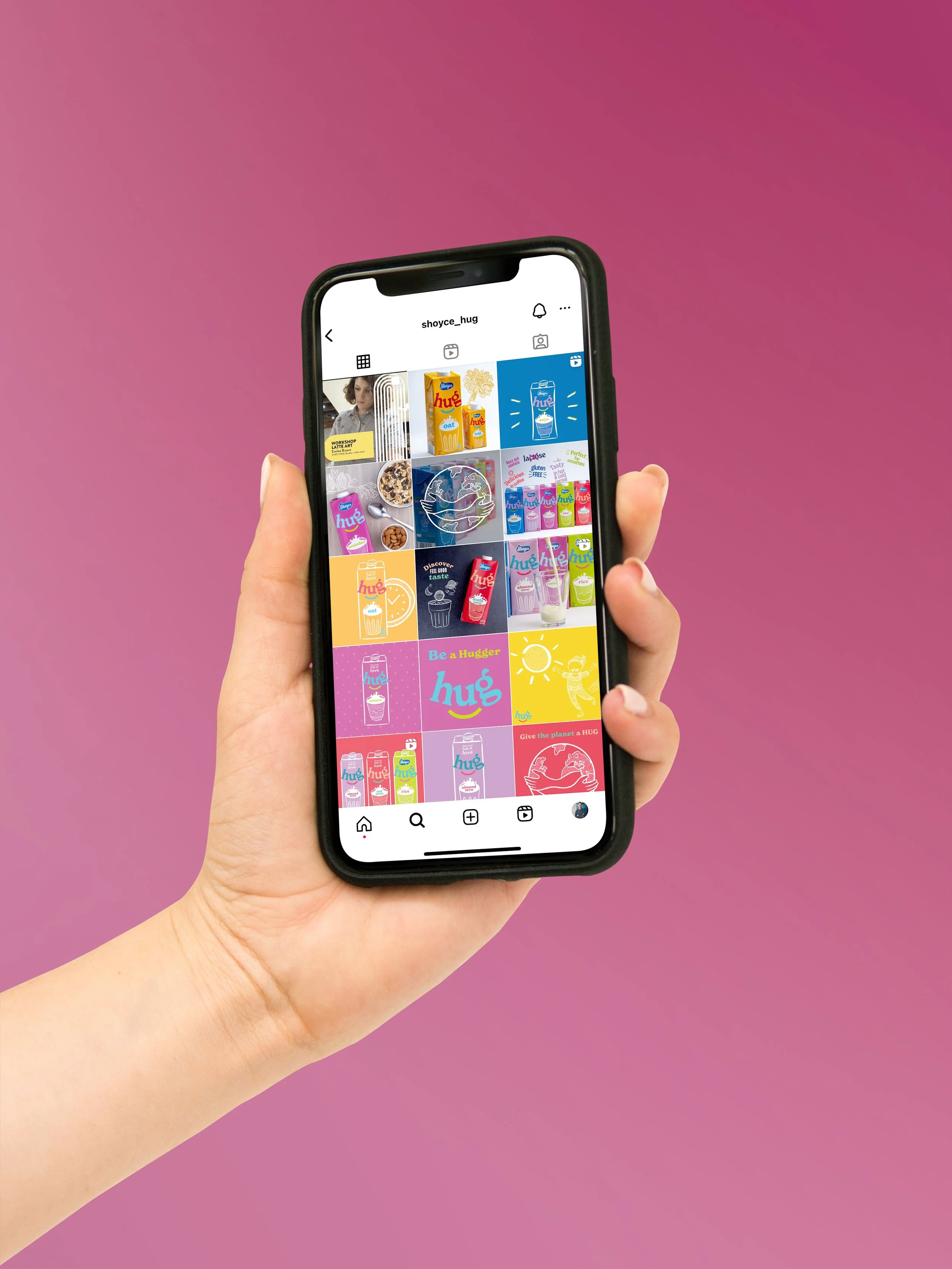
The result is Hug: a complete rebrand that is bright, colourful and unusual. The rest of the plant-based drinks category is white and beige in comparison. The new name 'Hug' wraps its arms around the audience and the brand now stands for love and care. Be it at a human level, through product expertise or by caring for the environment and sustainability. Creative Direction by John-Paul Hunter.
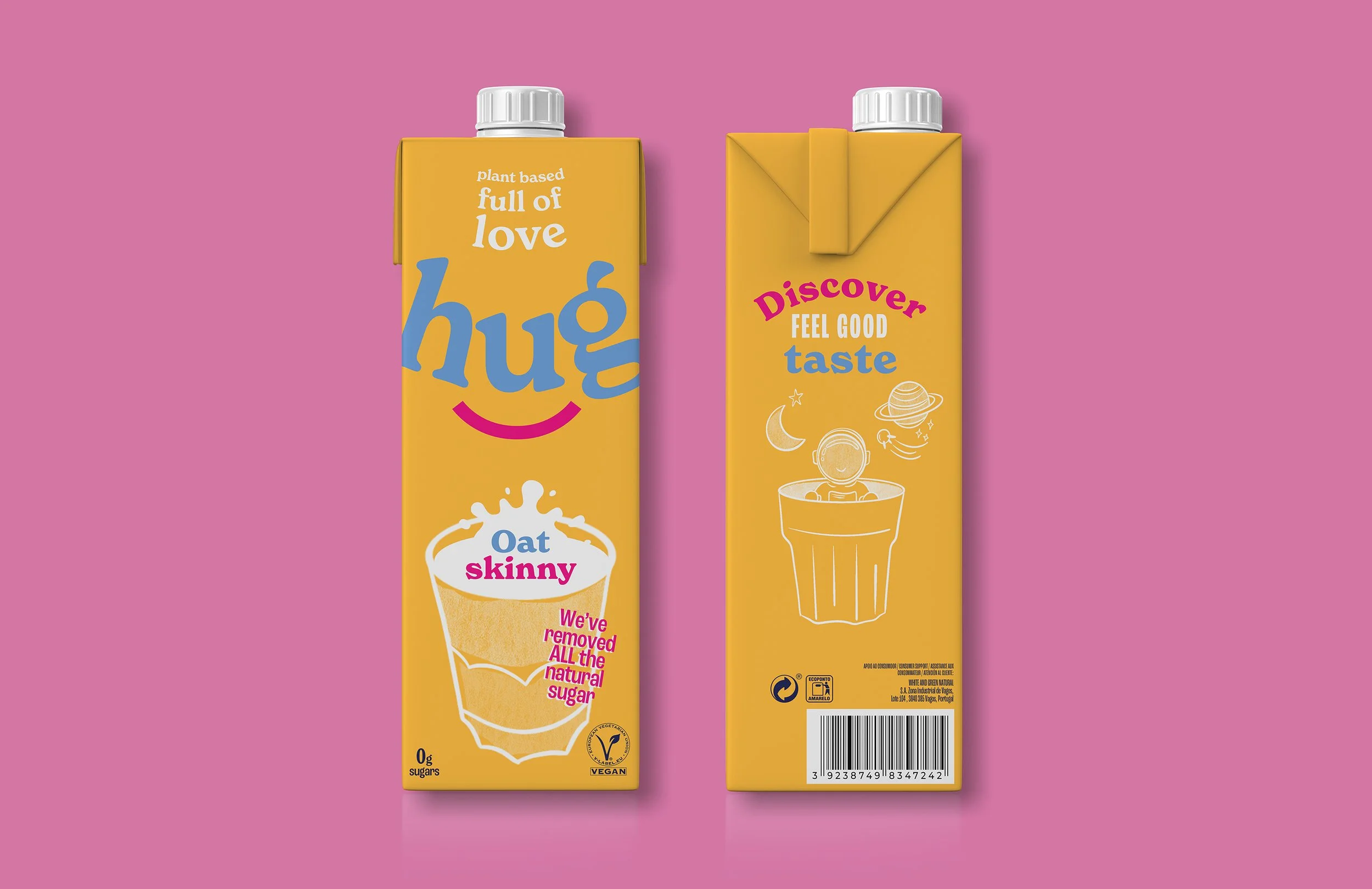
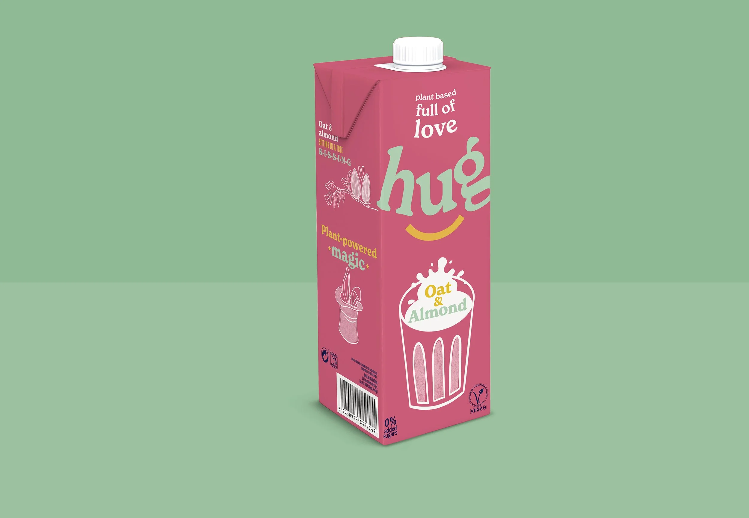
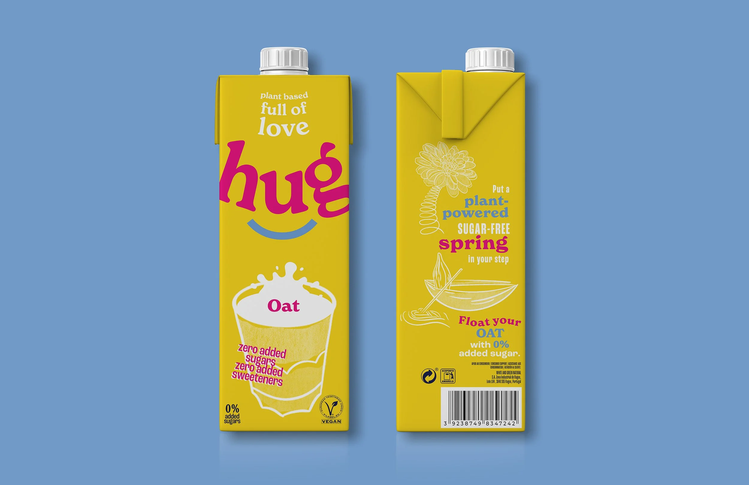
The packs feature engaging copywriting and illustrations that bring to life the brand proposition. There is something new to discover on each product and this also pulls through to the brand communications. I created a suite of soundbites for their 3 new Brand Pillars: Sustainability, Taste and Life. The best of these were placed across 15 initial packs at launch, from oat mylks to cooking creams.
One sustainability soundbite that I wrote was ‘We give the planet a hug’, and this has since become Hug’s new company tagline, visible across their website and socials, as well as on the side of every carton.
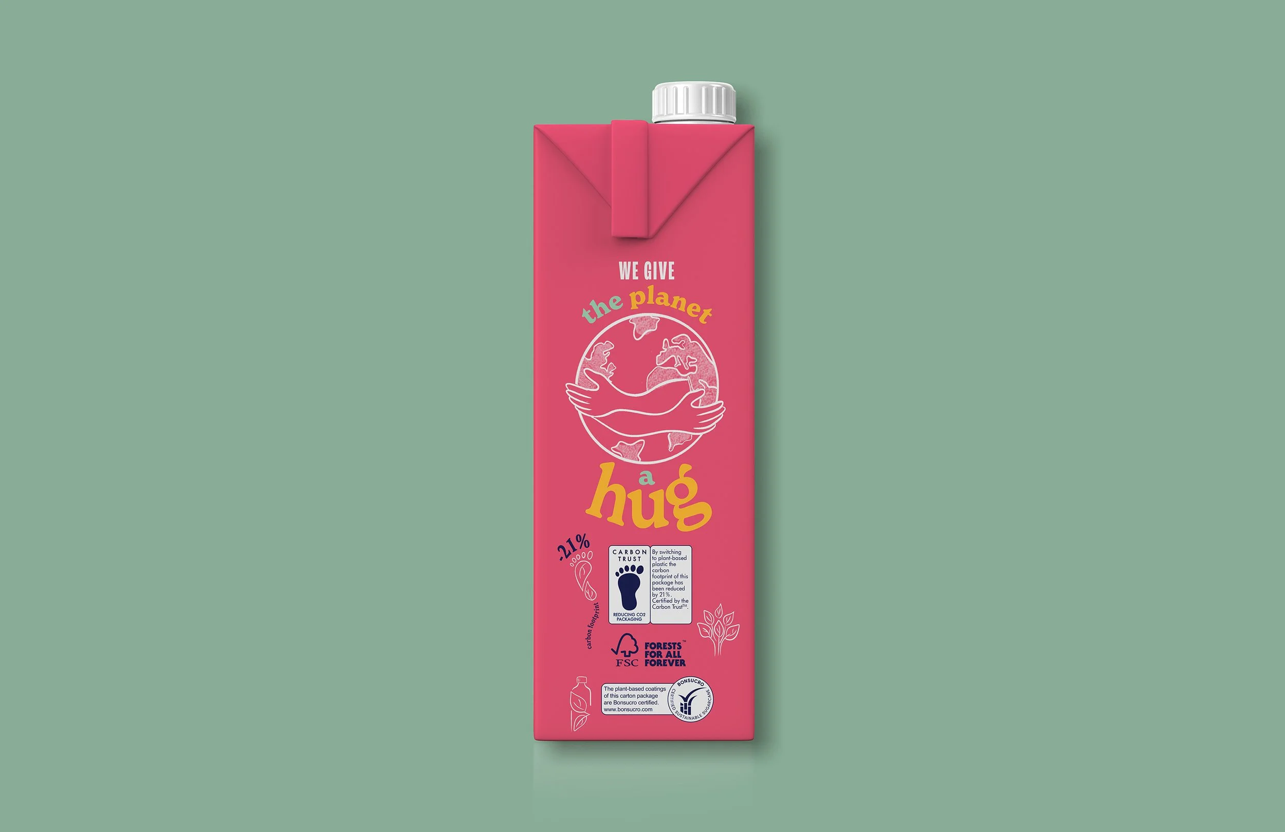
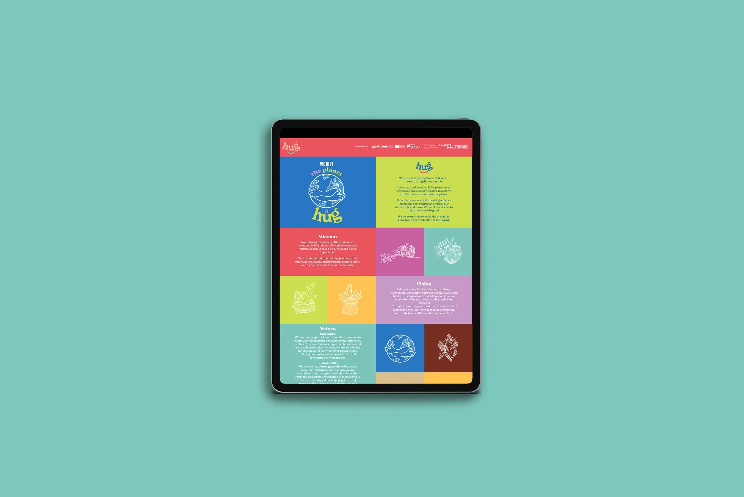
More sustainable production. More love for the planet.
By switching to plant-based plastic, the carbon footprint of the new rebranded Hug packaging has been reduced by 21%. Certified by the Carbon Trust which is committed to reducing CO2 packaging in line with Net Zero. Also certified by the FSC (Forests For All Forever). The coatings on the packaging are plant-based and are Bonsucro-certified (certified sustainable sugarcane).
This new commitment to more sustainable practices gives allows them to have a tagline like ‘We give the planet a hug’ because they’re making real changes; not just paying lip-service to green goals.
In this line, the brand name is neatly included into the brand proposition in a compelling message about sustainability that audiences will connect with.